
This project is for the indie webcomic Tales of Gregaria on Webtoon Canvas. I was commissioned to redesign some of the main characters as a stylization trial for this project. I was asked to stay within my style, but put a Disney twist on the characters in regards to stylization.
I was given a lot of freedom per redesign, and multiple phases of feedback and critique were passed between myself and the client before the final shipped product.
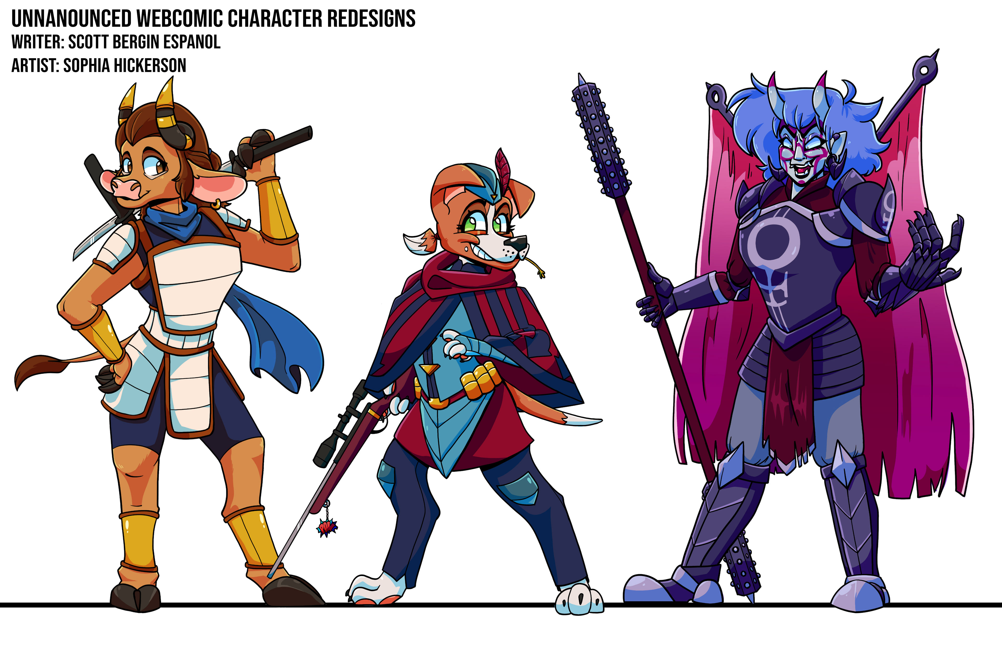
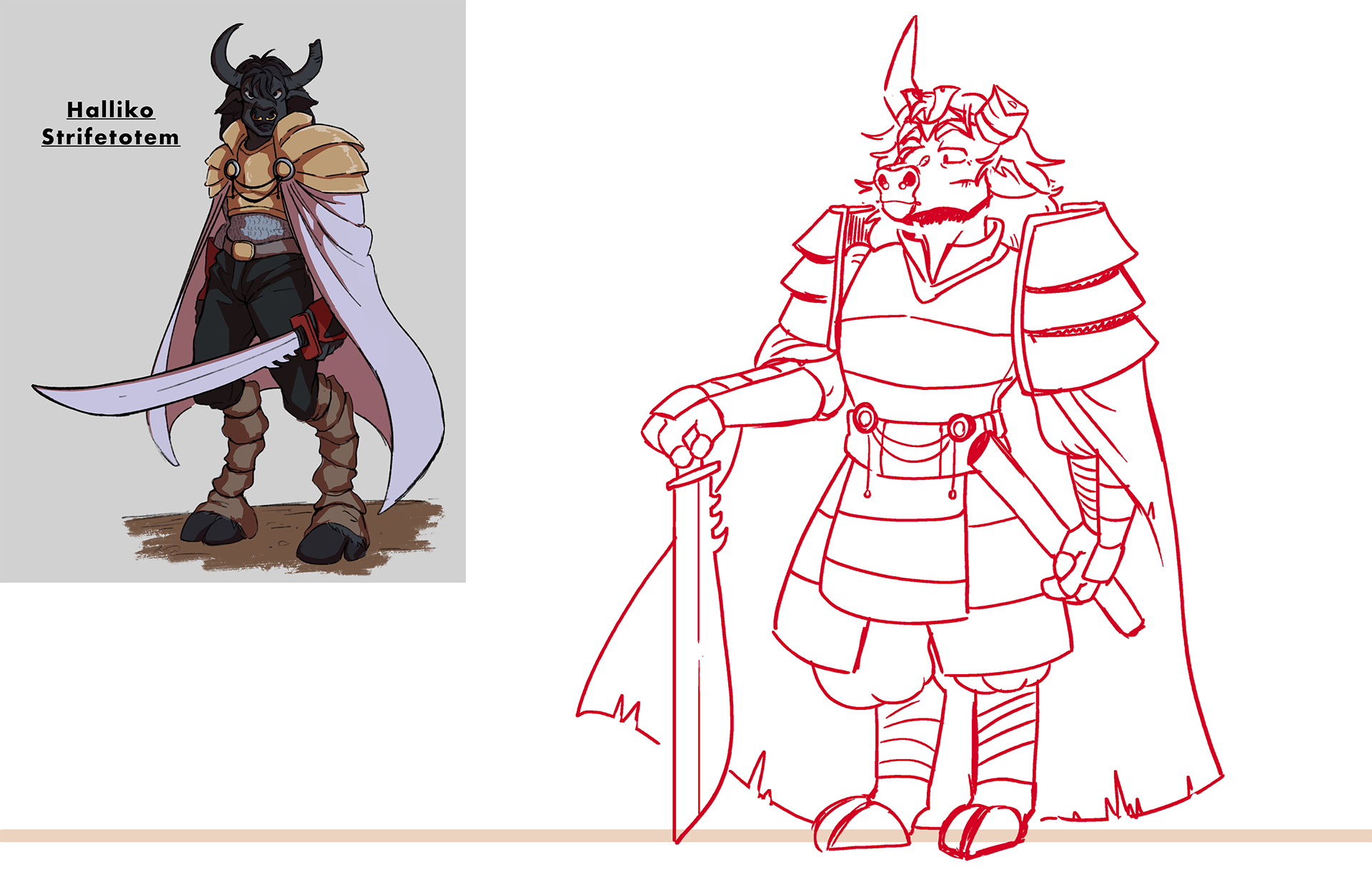
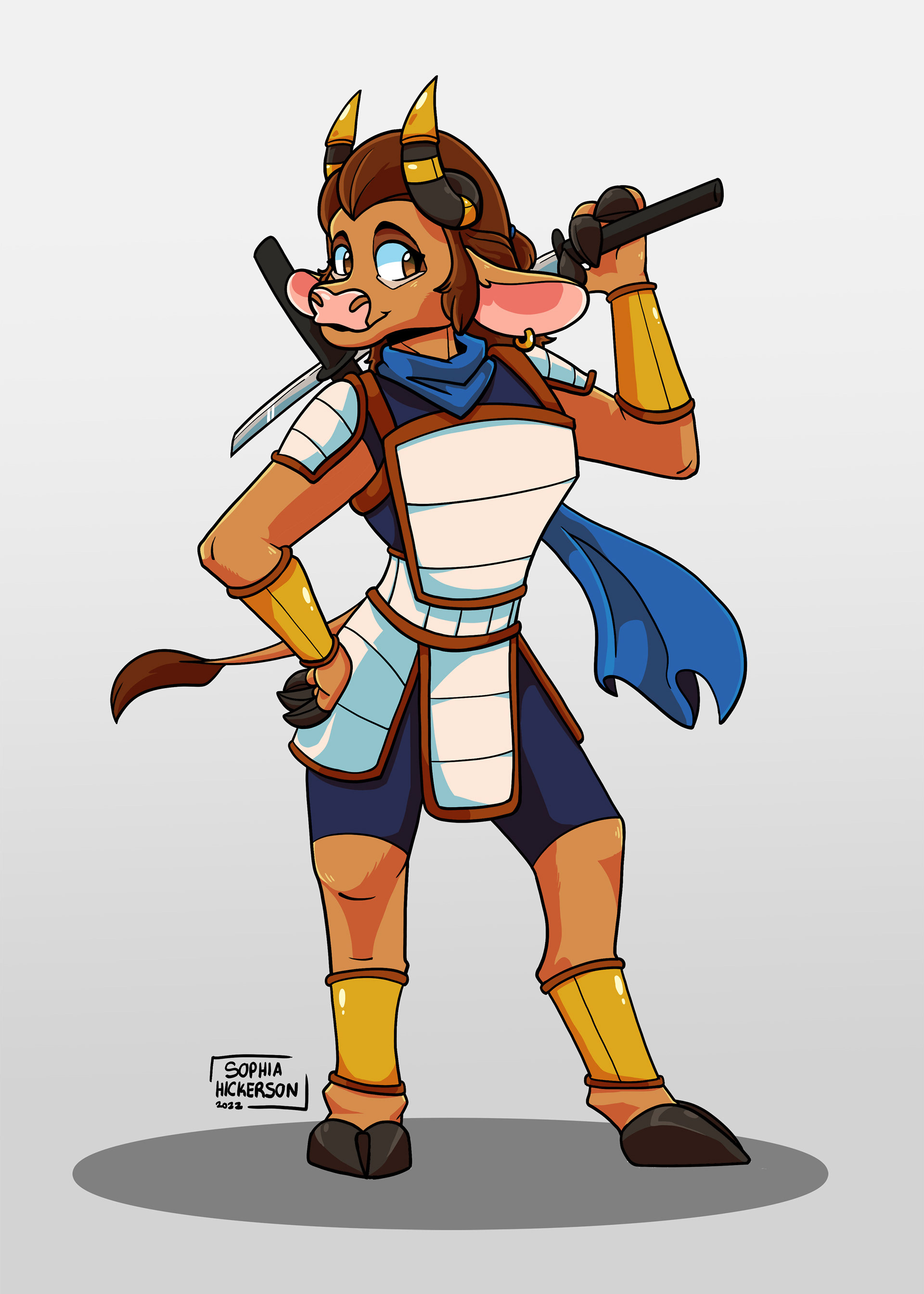
Protagonist Design Process
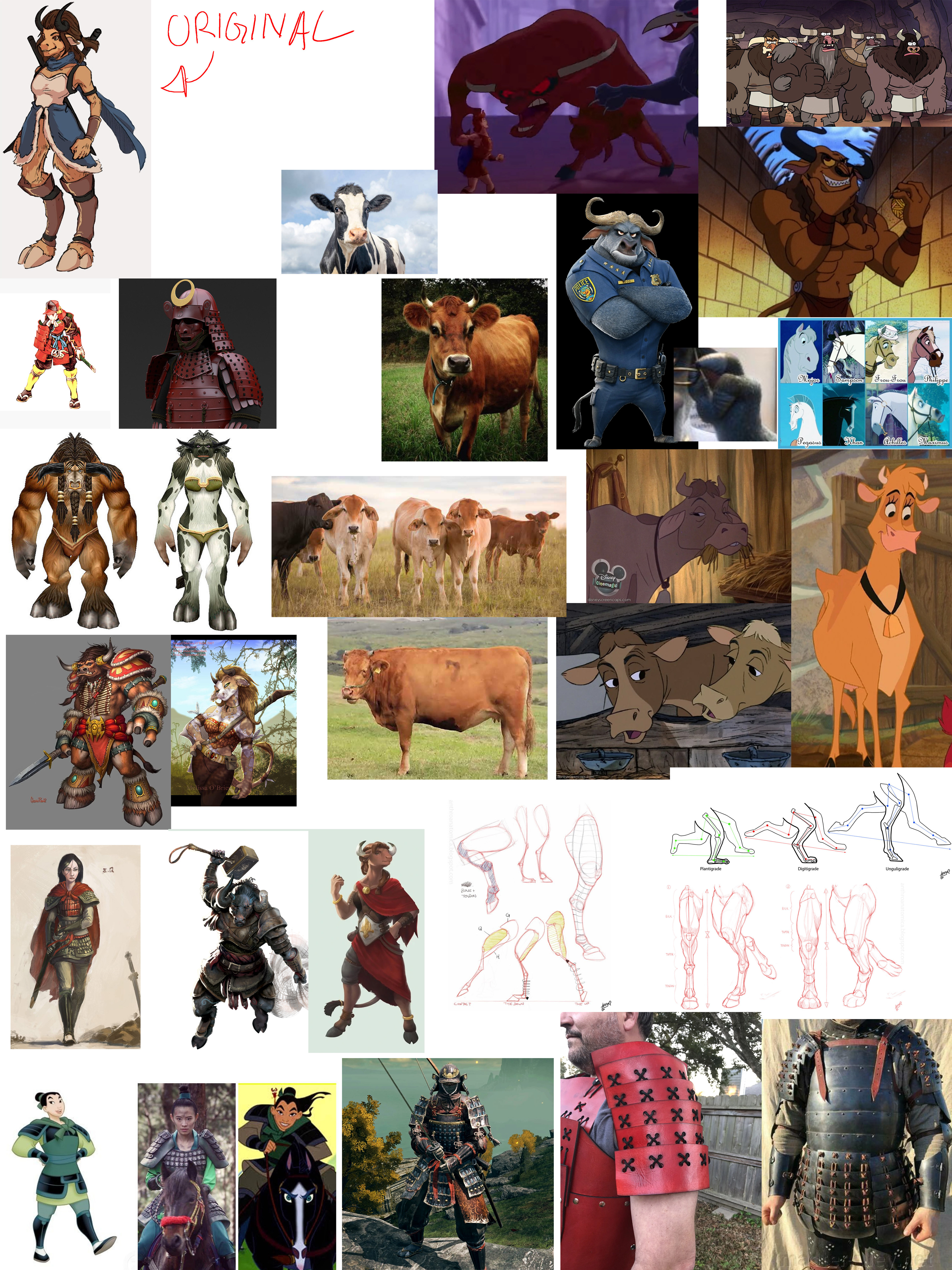
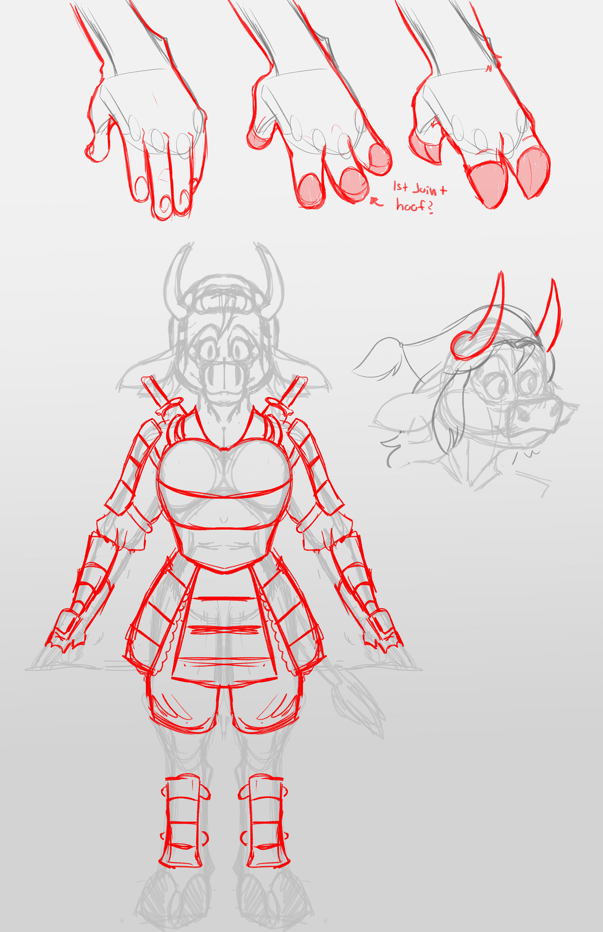
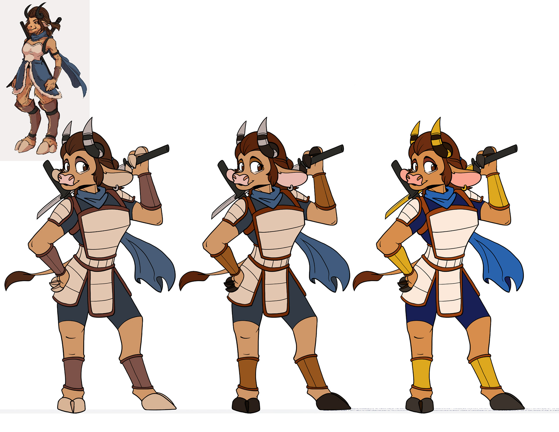
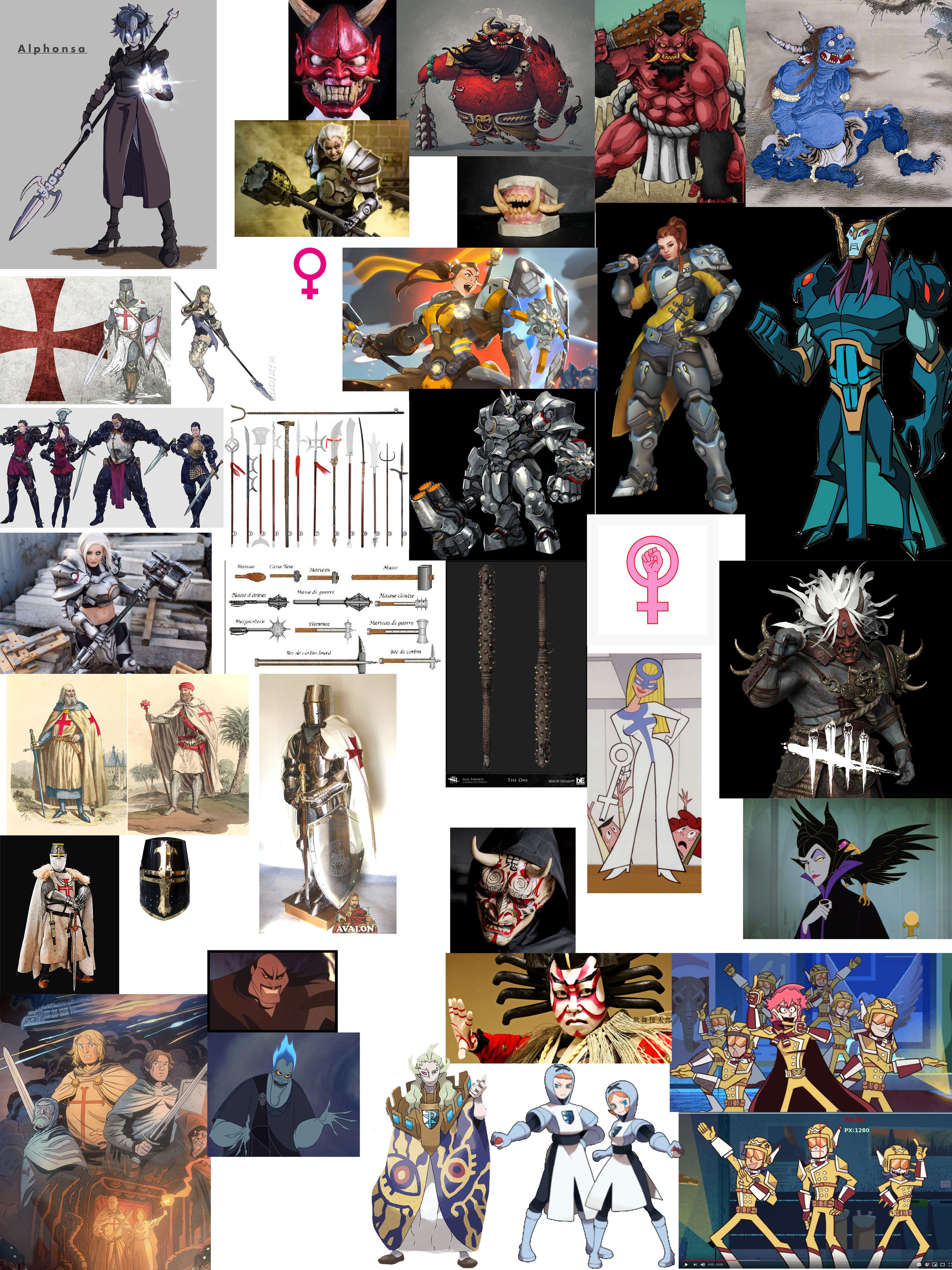
The protagonist, Asteria, is a minotaur samurai, and I was asked to redesign the armor, as well as make the design lean more bovine than the original (seen in the top left of the mood board). I also made the colors more vibrant and poppy, suited for the intended tone of the comic.


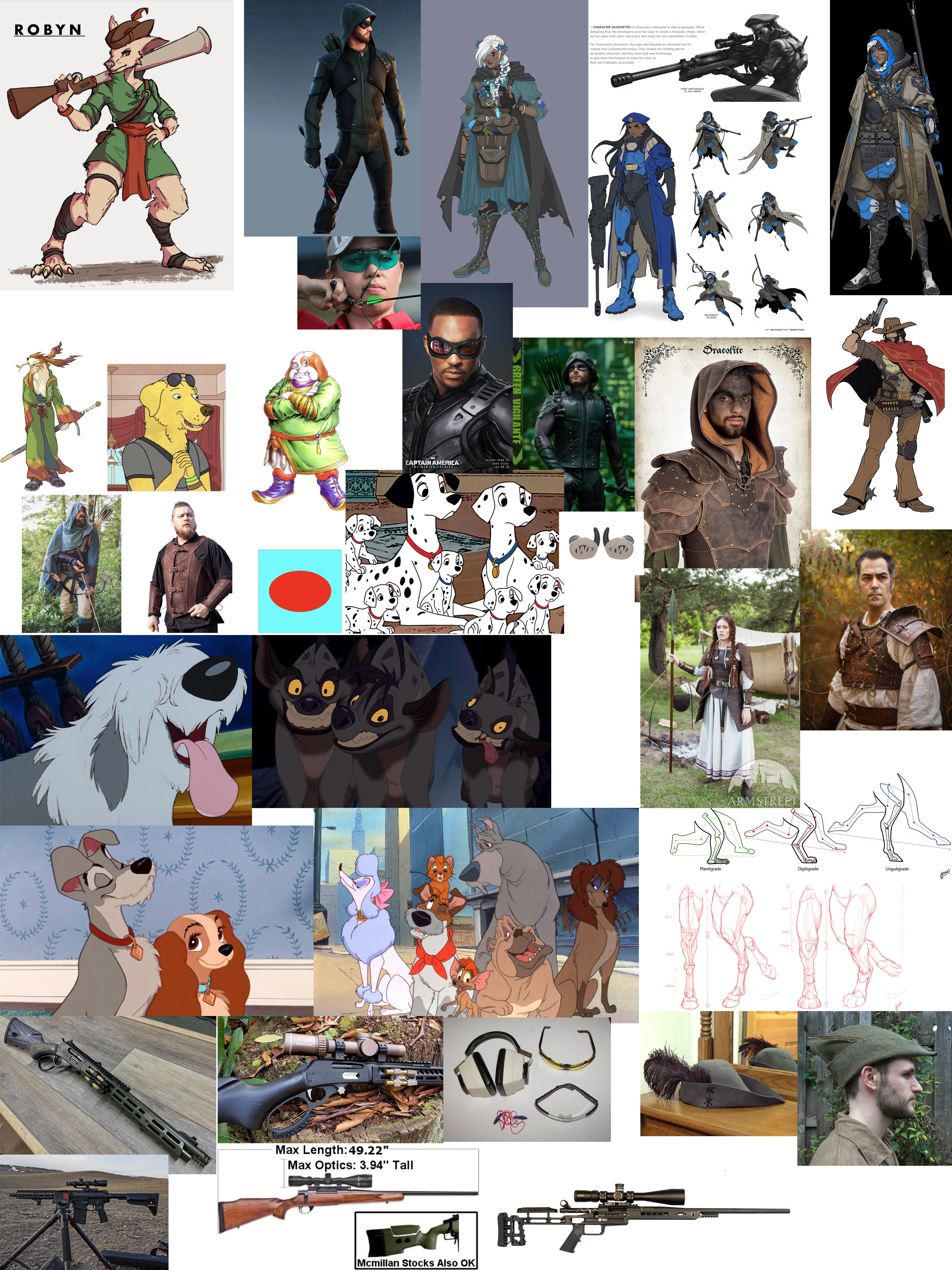
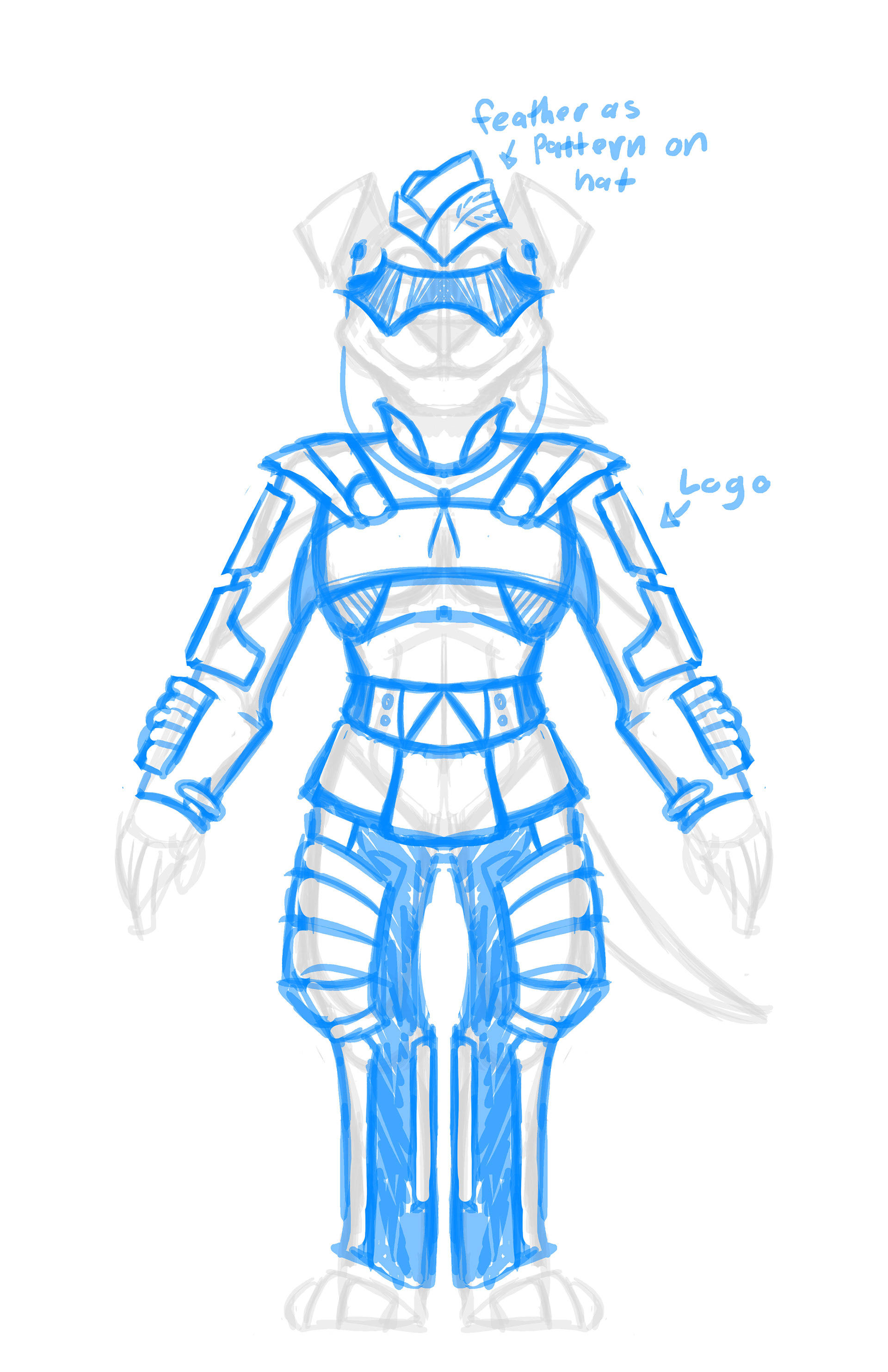
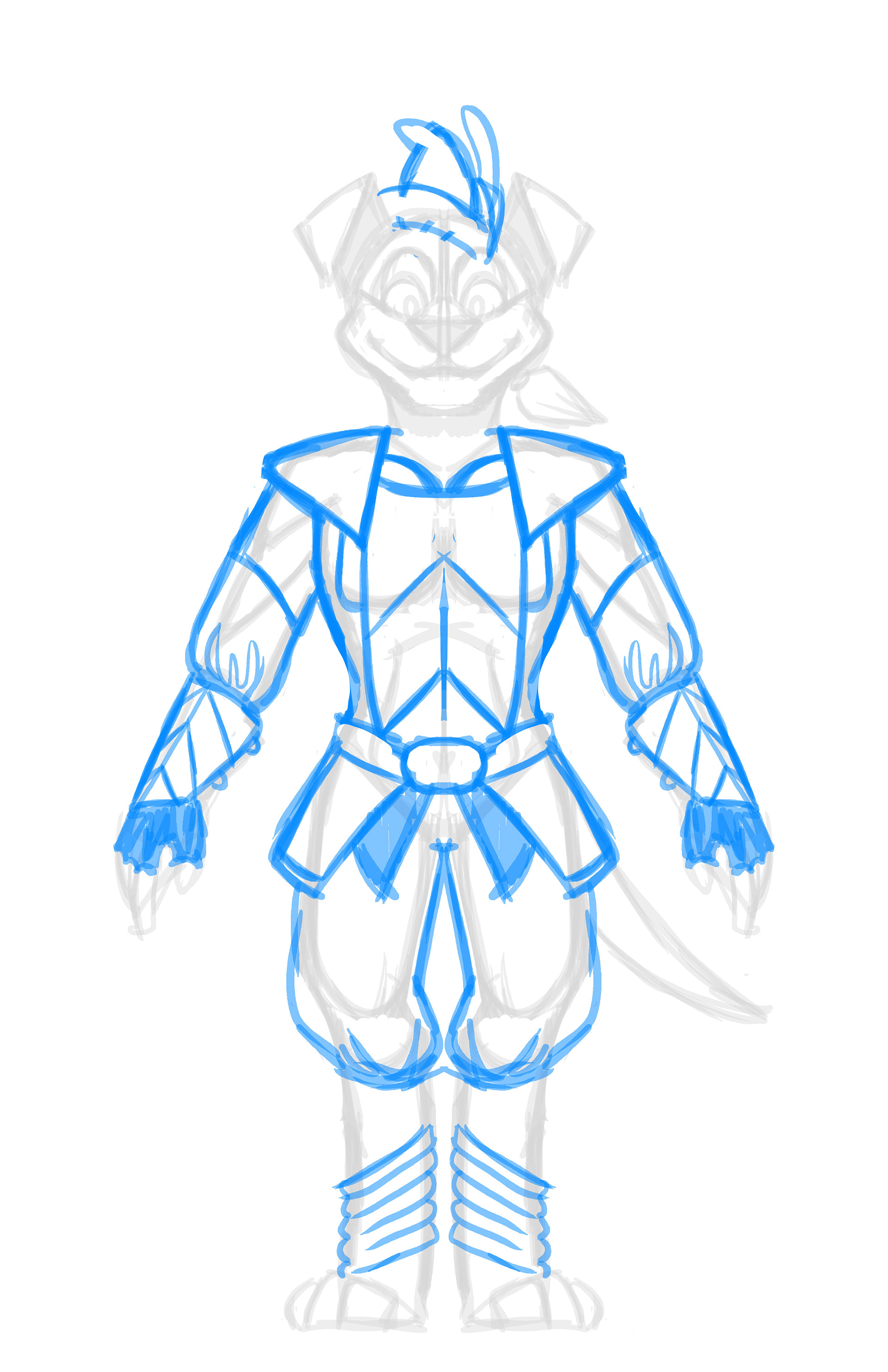
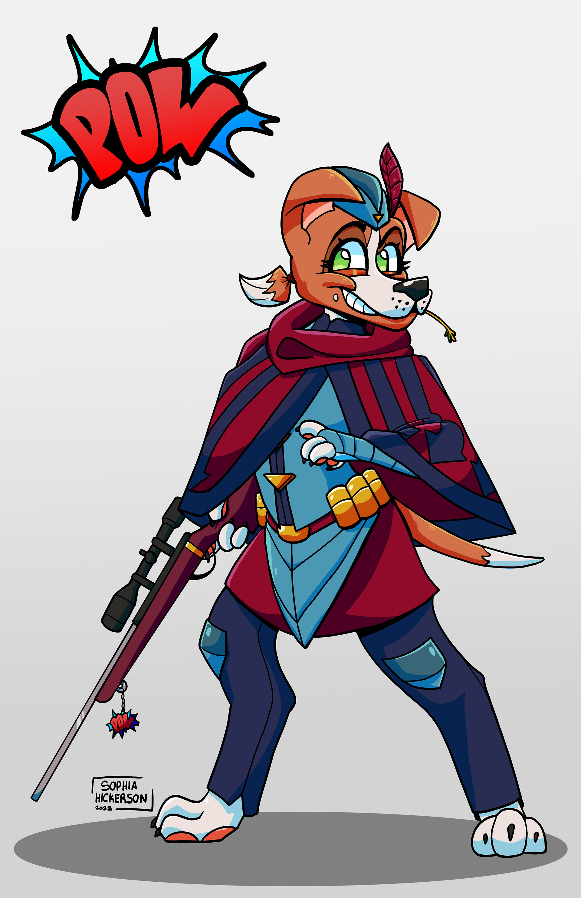
Secondary Protagonist Design Process
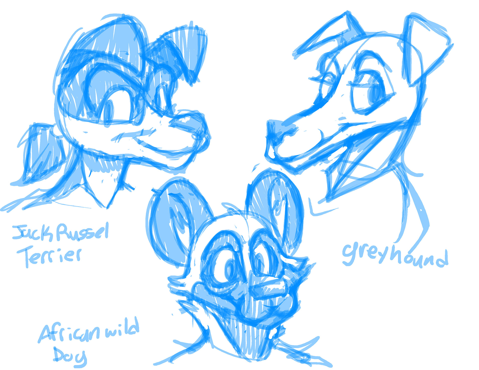
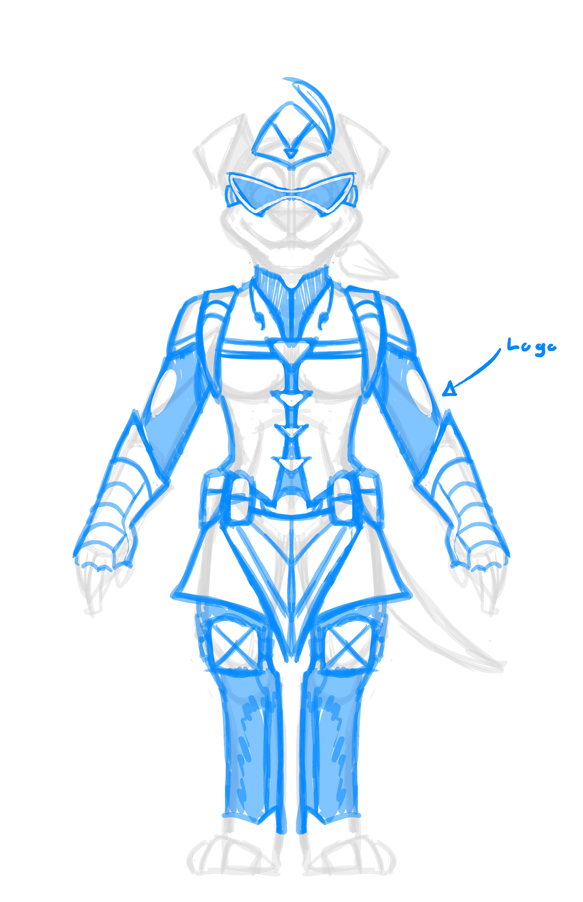
The Secondary protagonist, Robyn, was made in complement to the protagonist. The main changes for this character were to change her canine breed, armor, rifle, and color palette.
Much of the breed consideration was taken to account for the character's personality and role in the story as a sharp shooter. A more modern spin was given to the classic robin hood motif to complement the comic setting's diversity of tech, as well as to suit the more modern gun she carries. Many of her colors match the main protagonist's or serve to complement them.
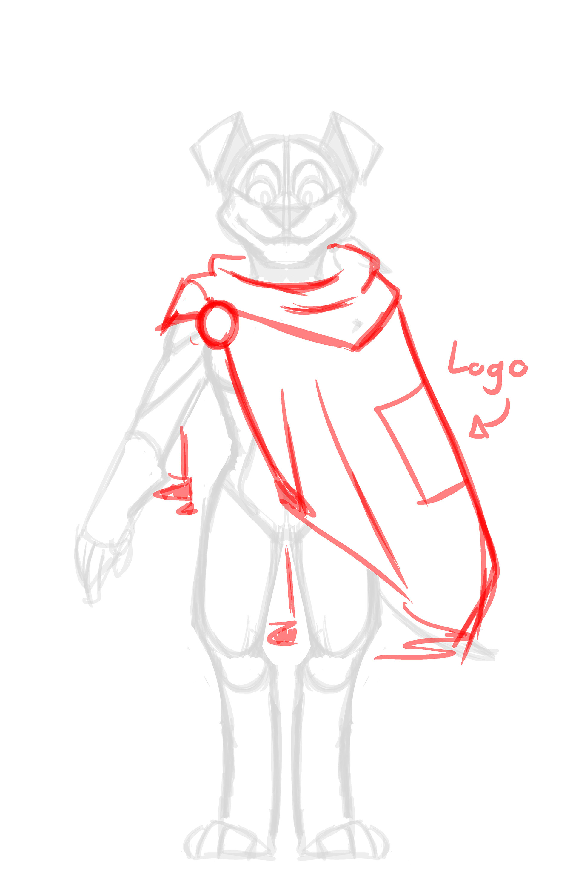
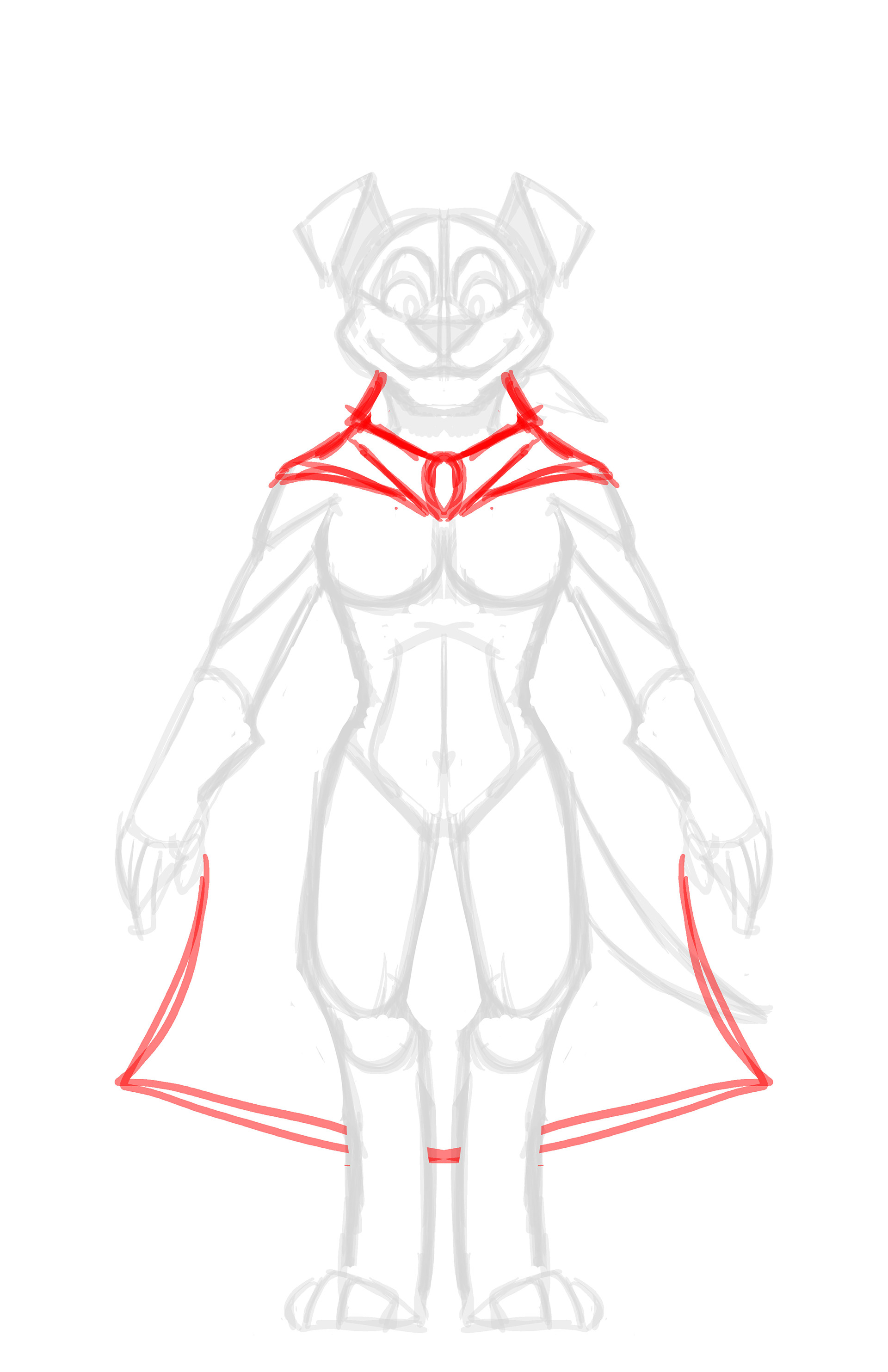


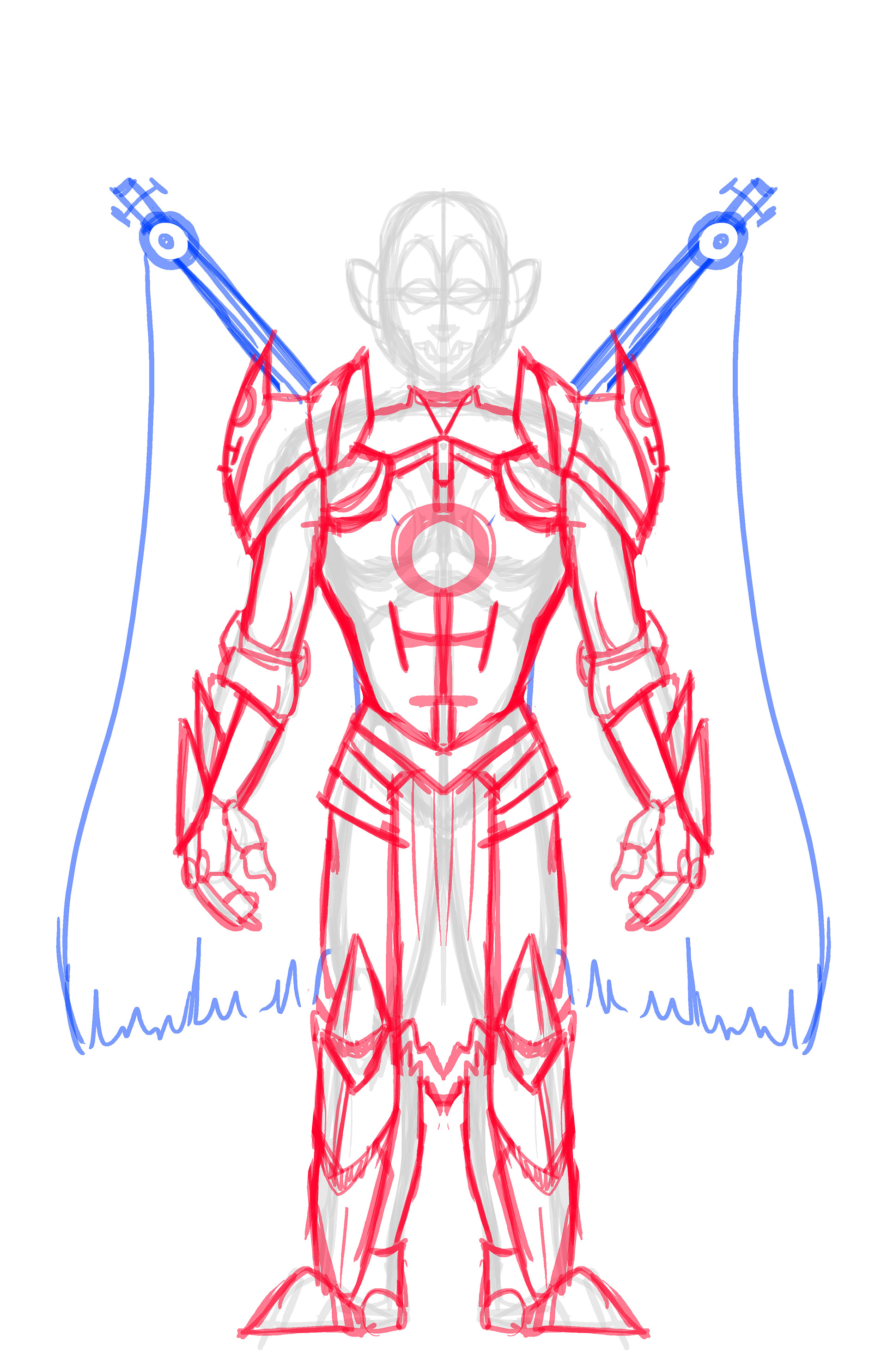
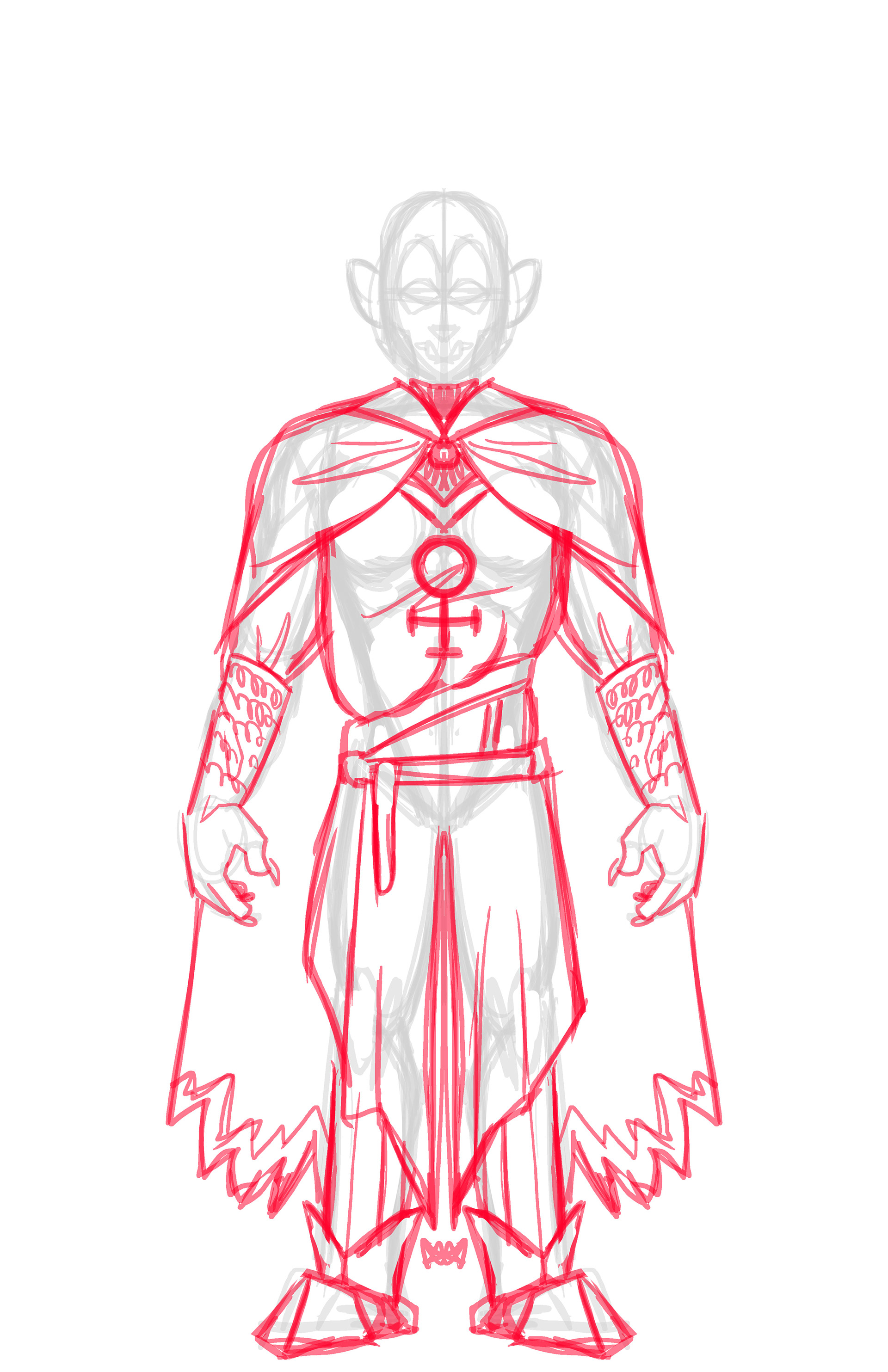
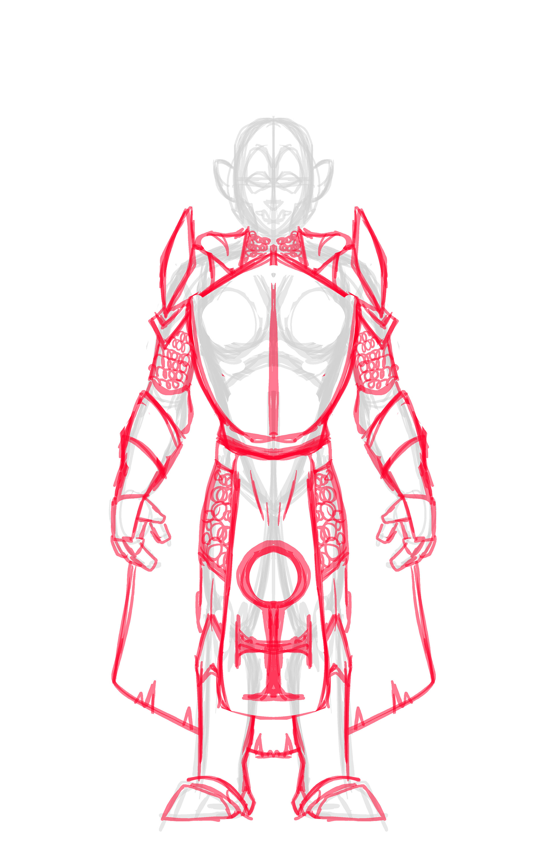
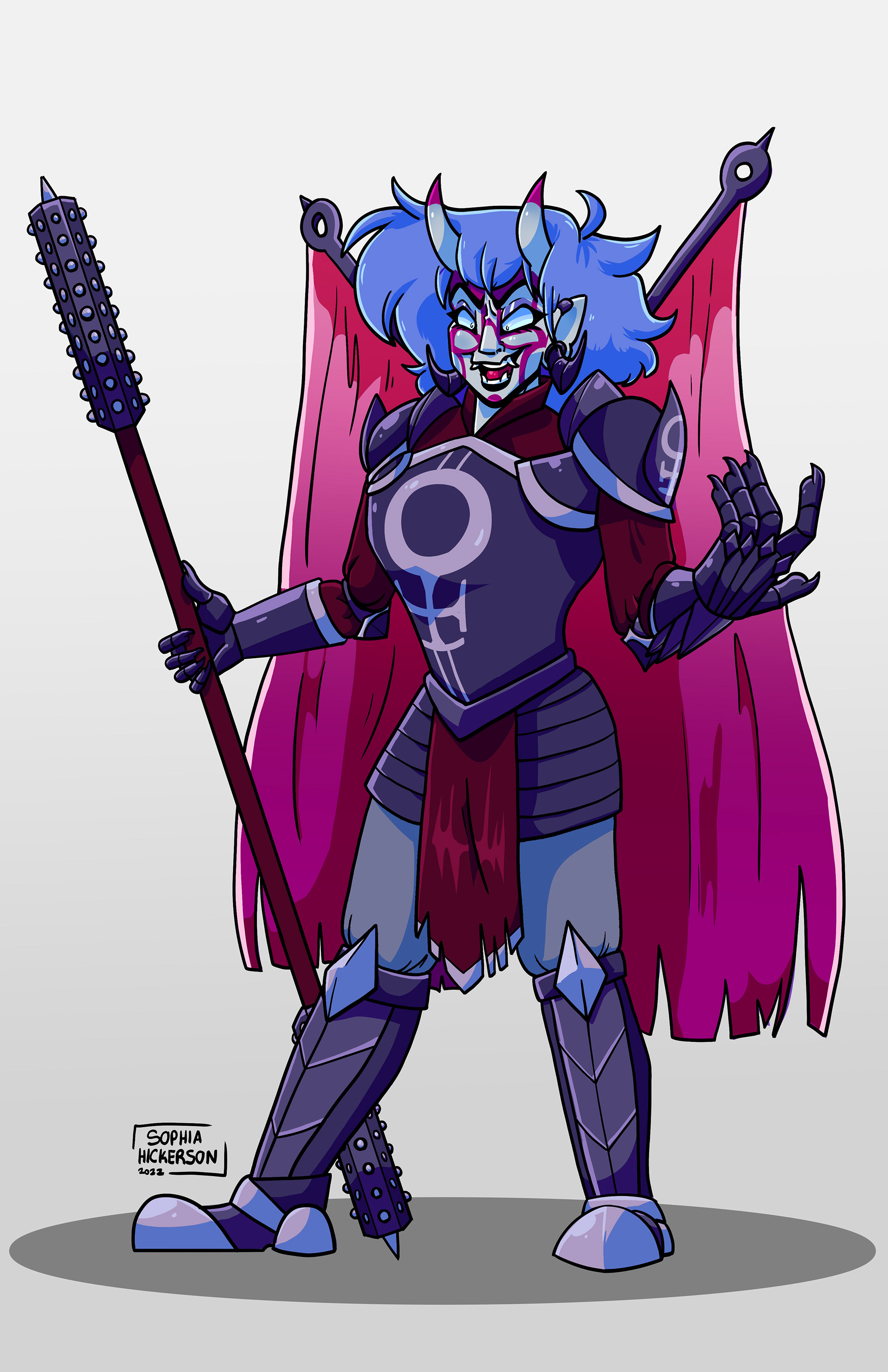
Antagonist Design Process
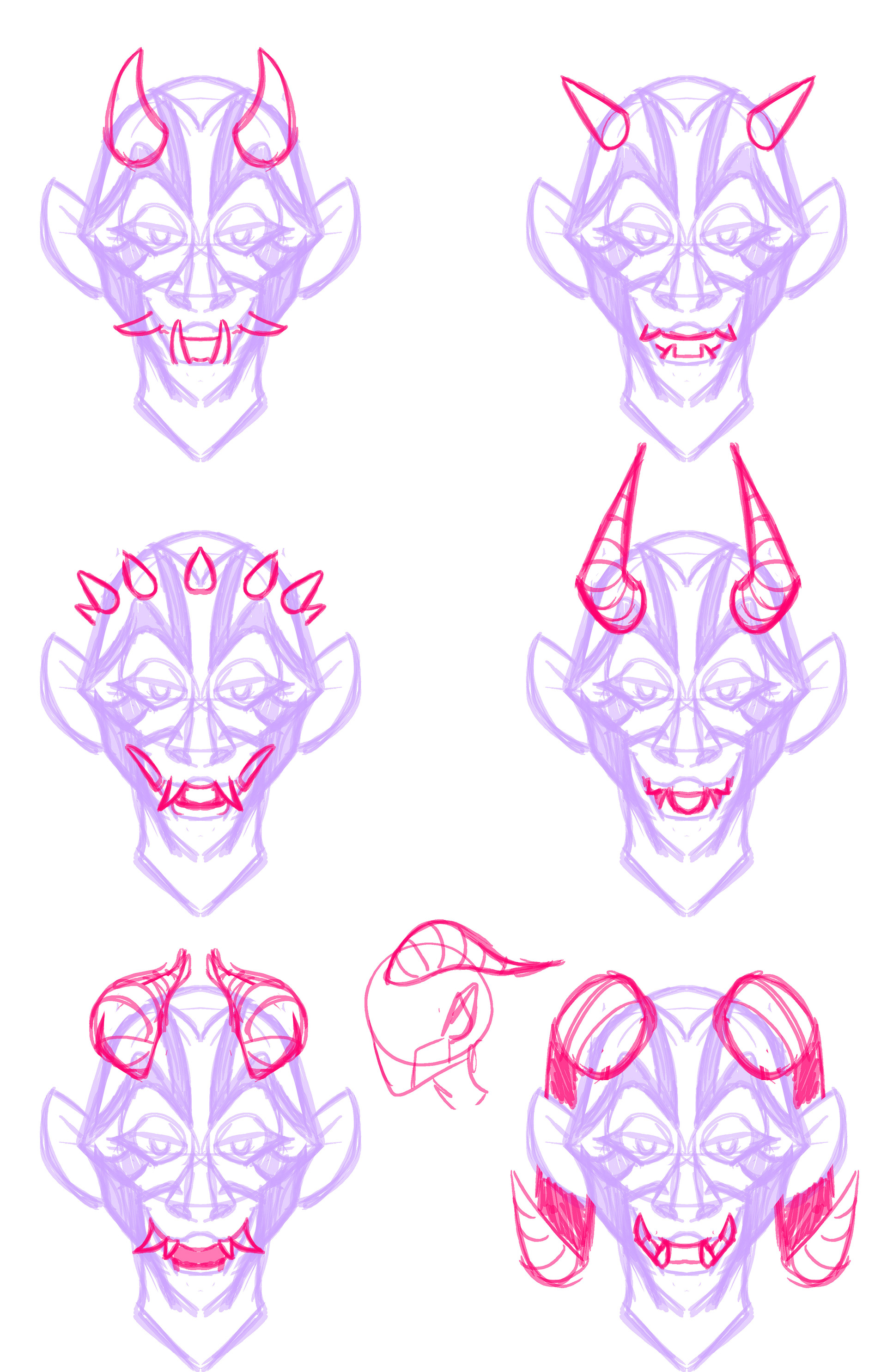
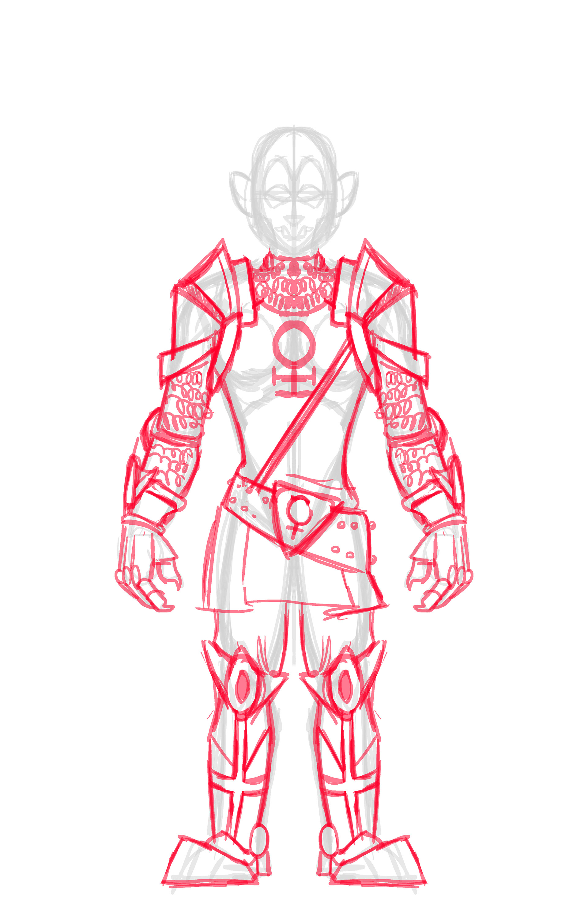
The final character, one of the main antagonists, proved one of the most interesting legs of the project. For her design I was asked to redo the armor, give her organization an emblem, and redo her colors for the organizations actual colors. Other than these parameters I was given free reign to edit hair, horns, body shape, and weapon type (with the condition of it being a polearm). The character is an Oni and her organization is a riff on the knights of templar, but run by only female members. I sought to combine these three major elements in her design to make an imposing villain.
For her emblem, I combined the templar cross and the female symbol, a simple but elegant combination to stand for the group. I decided to study traditional Japanese art and kabuki theater for her face and modeled her war paint and teeth after these masks.
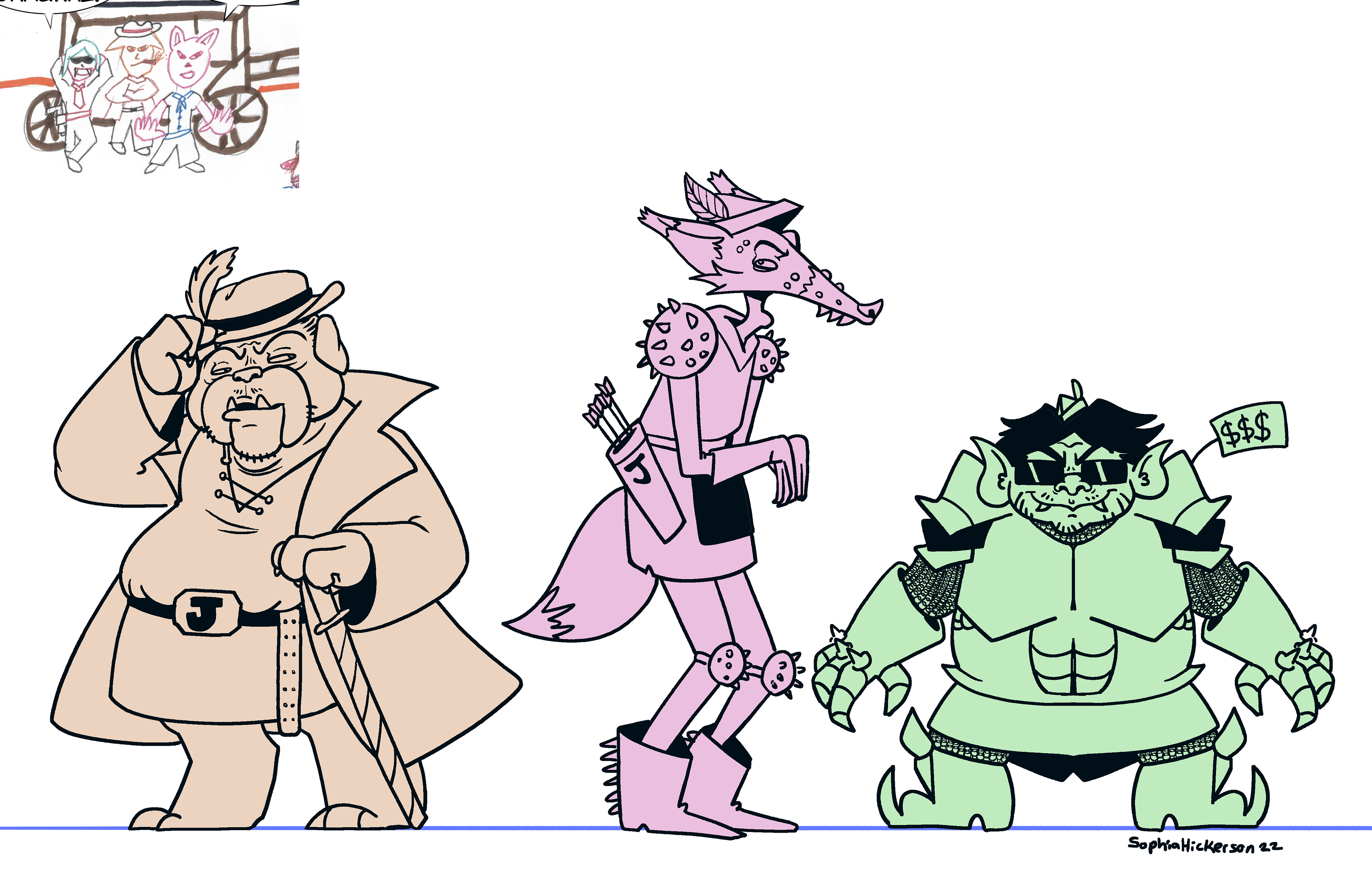
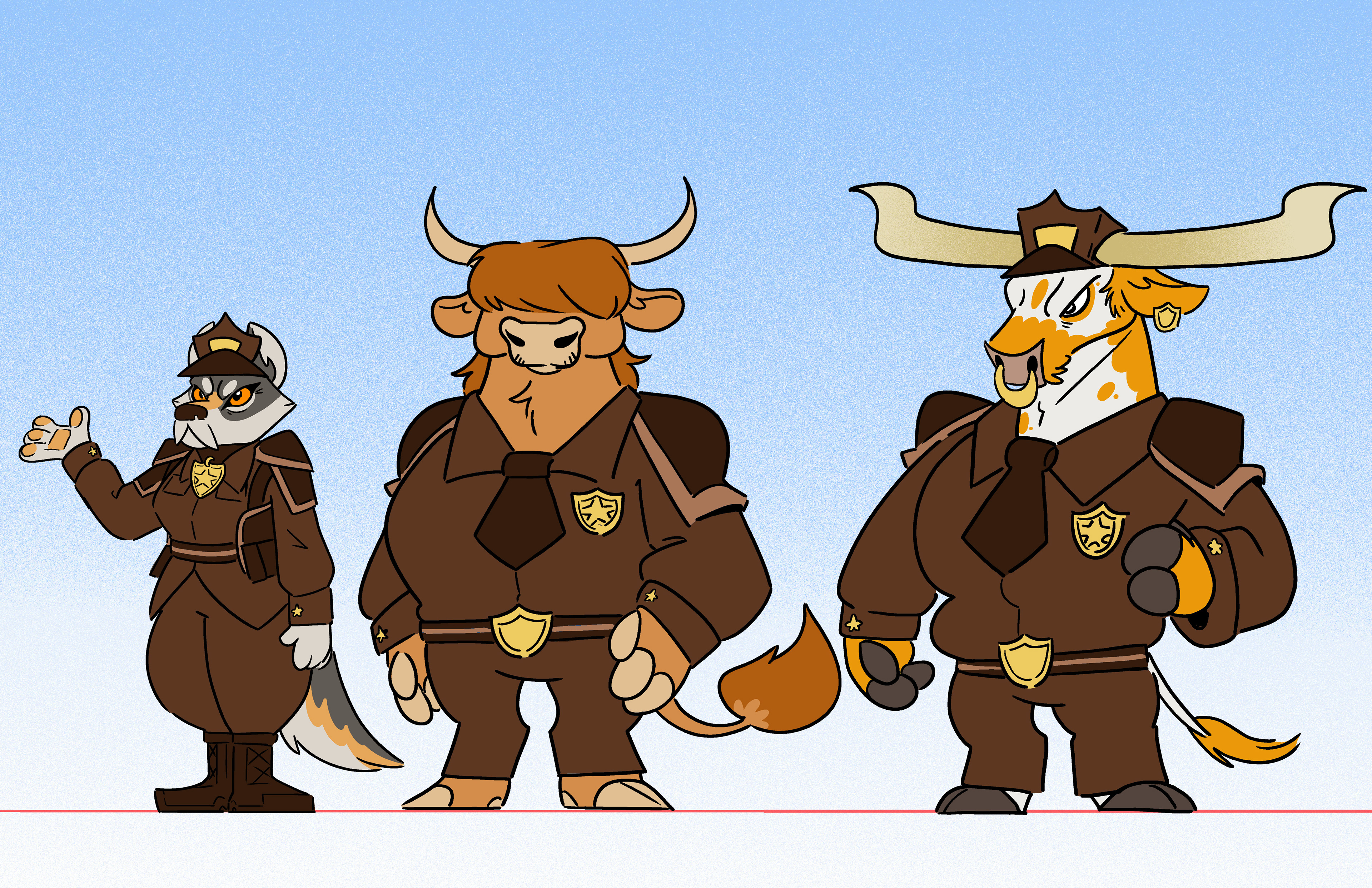
Additional designs for the comic are included below